
The NYC Subway – it is notorious when it comes to their service and punctuality, but its aesthetic is one of a kind among the city transportation systems all over the world.
“NYC SUBWAY STATIONS” have iconic signs, designed by Massimo Vignelli, and they have been a major part of our city’s aesthetic. From A, C, E, D … to 1, 2, 3 … The letters and numbers in the starkly-colored circles guide us to our destinations.

However, they are not the only part that makes NYC subway stations look outstanding. Consciously or unconsciously, we are witnessing even more iconic looks.
For instance –


The stations are usually very dark and crowded, and sometimes they might look identical from the inside of the trains. To avoid confusion, perhaps, each station has redundant signs displaying the station name. These are typically made of tile and they provide the very iconic look of our subway stations.
Also, a lot of stations have designs for each initial.


They are very old school and modest, but still, they give each station its own personality.
Each station speaks to you more indirectly, too, but it is also very unique.

For example, these horses can be found at the Fifth Ave/59th Street Station, which a lot of people get off at to go to Central Park – where you see actual horses.
Another one is at the Lexington Ave/53rd Street Station, where MoMA is nearby. This great mosaic wall welcomes you before you reach MoMA.

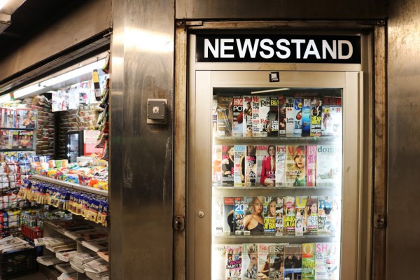
NYC is a simple city – there’s only uptown or downtown, and east or west. However, there’s so many people from all over the world, for so many different reasons. There are tourists, commuters, students, performers, protesters, homeless people, police officers, etc.

There’s always something happening at every station, and the NYC subway stations somehow play a very major role in your memory.
